
 Happy Thanksgiving! 2012 has been an amazing year for me. After so many years of tough trials, health problems, financial woes, and other worries, it’s been so wonderful to have a lovely, fun and successful year.
This year I began working as the social media manager for Degreesearch.org, a website that helps prospective students make informed decisions about their education choices. Not only is this job a great fit for me, but I have a lot of fun with it. Although our site is higher education focused, we also like to have a good time for holidays and other seasonal events. We work on creating content that is not only engaging, but is also shareable. Joseph, our creative director, decided to make a really fun “pie chart” infographic about Thanksgiving pies.
It turned out fabulous, didn’t it?
![Pie Charts [infographic]](http://degreesearch.org/blog/wp-content/uploads/2012/11/pie-chart.jpg)
Via: DegreeSearch.org
If you look closely at the pictures in the infographic, you can see…it’s made with real pie!
Infographics have become a popular marketing tool in the last few years. It’s a great way to make visually-appealing data representations, and can bring in new audiences to your website if done correctly. For as many infographics that are made well, there are just as many that are made poorly. For this infographic, Joseph used data from a recent survey from Pillsbury revealing that 94% of Americans plan to eat pie over the holidays, and two-thirds of Americans prefer holiday foods over gifts. He took the percentages from a Schwan’s survey (the makers of Mrs. Smith’s pies), where Americans were asked what their three favorite pies were.
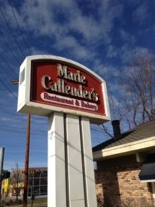
 Joseph made lots of phone calls to local bakeries and pie shops to see where he could buy the pies he needed for the infographic. After realizing all of the photography and footwork would be hard with one person, he recruited me to be his assistant for the day. We started out the day by driving to Marie Callender’s, which was halfway across the Salt Lake Valley from us. Marie Callender’s had all but one of the pies that we needed for the infographic. We purchased traditional apple, apple crumb, chocolate cream, key lime, peach, pumpkin, pecan, lemon meringue, and blueberry (which used up our November “creative budget” for the department).
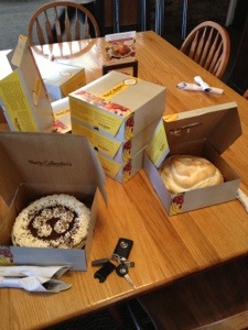
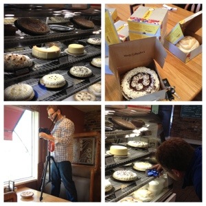 At first, the plan was to get all the pies, then do the photo shoot back at the office. As the pies were being boxed up, we realized that they may be too damaged if we waited to take them in the car (especially the lemon meringue). So we asked the manager if we could set up the camera and tripod in the back of the restaurant at a table with the best natural lighting. Dozens of pictures later, we boxed the pies back up and carefully arranged them in his trunk. I held the lemon meringue pie in my lap (with the box open) to make sure that it survived the drive back to the office. We drove a few blocks over to Granite Bakery, which was the only place we found (after many phone calls) that had a cherry pie in stock.
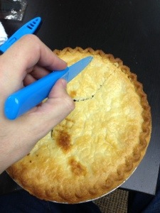

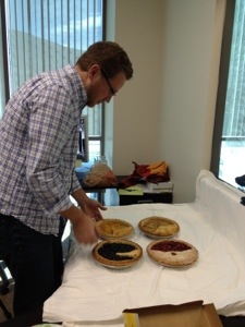
Once we were back at the office, Joseph began working his creative magic. Because most of the fruit pies had a pastry crust, it was hard to see the fruit inside. Joseph used a sharp knife and commenced in crust excision and pie surgery to remove the tops of the pies. He cut the pastry tops on 4 of the pies to the percentages that he would use for the bottom half of the graphic.
 Once all of the photography was finished, Joseph uploaded the pictures into PhotoShop and began creating the layout of the graphic, and editing, formatting and resizing the images. The finished product published on our blog, and we’ve been promoting it since it was complete.
Oh, and are you curious about all the pie we had? After all of the pictures had been taken, all of the pies were taken into the break room for employees to eat. Ten pies, twenty employees….you do the math.
What do you think? Do you like how it turned out? Does it make you want to try making your own infographic?
